Hello all. This is your UI/UX designer Paul here. For this week I have the newest, most zeroed-in "look" of the Asset Screen!
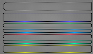
My last post showed the experimentation phase. Now the style is coming together. To make each bar holding the player's assets pop and self-distinguish, a gradient matching each bar's color scheme was devised.
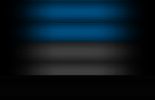
A new "scan line" background was made for the actual fill of the Asset Screen's bars. The image above shows how it was made and how each step builds off the last one. A flat high-resolution backdrop of black and …